Briant Broadband
Client
Briant Broadband
Year
2024
Category
Services
Type of Work
Logo Design
Brand Identity Design
Art Direction
Briant Broadband came to me with a clear ambition: to redefine the broadband experience through a modern, confident, and instantly recognisable visual identity. The project began with in-depth research into the broadband market and user expectations. From there, we developed a concept built around speed, connection, and clarity—values that are essential for a company delivering high-speed internet services.
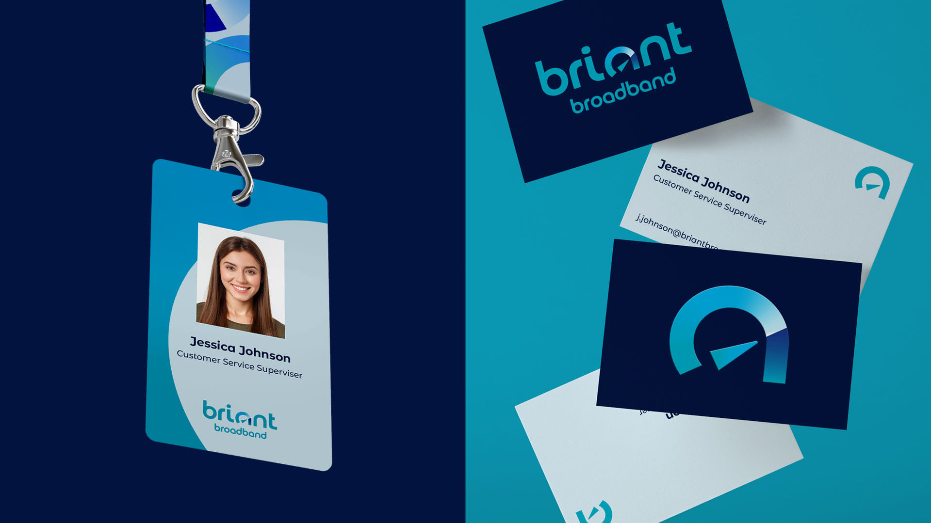
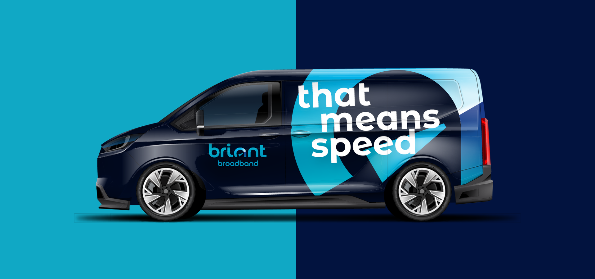
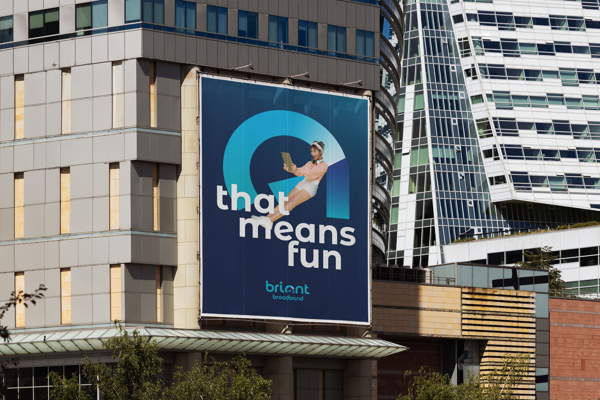
At the core of the new identity is a logo that subtly transforms the letter 'a' into a stylised speedometer—visually expressing the promise of fast, reliable connectivity.

This symbol sets the tone for the entire brand language, which uses clean typography, a vibrant colour palette, and a consistent grid system to convey professionalism and energy.
The rebrand included logo development, typography and colour guidelines, digital and print materials, and templates for future use. Through regular feedback sessions, we ensured that the final result was not only visually striking but aligned with the company's evolving goals and long-term strategy. Briant Broadband now stands out in a crowded market, offering a refreshed and trustworthy identity that speaks directly to today’s digitally connected users.


The rebranding allowed Briant Broadband to establish a distinctive identity that embodies commitment to speed, clarity, and contemporary digital services.